BRANDING


NOVEMBER 2024
PERSONAL PROJECT
OLIVAS
I recently participated in a design challenge from @modernbrief, where I created a Mediterranean-inspired brand concept for an olive snack. Despite not being a big fan of olives myself, I approached the project with a fresh perspective, aiming for a chic yet playful identity. My focus was on bold, natural design elements that capture the effortless elegance of Mediterranean culture. This project allowed me to experiment with a more vibrant and characterful style, and I’m really happy with the final outcome.
OLIVAS`S GALLERY


APRIL 2025
COMMISION WORK
BEANIE COFFEE
I was commissioned by Beanie Coffee to create their brand identity. The only guideline was to incorporate the color green — everything else was completely up to me. The name instantly inspired me to create a mascot, which I used across the packaging design in different poses.
BEANIE COFFEE`S GALLERY


OCTOBER 2024
PERSONAL PROJECT
FRITURE
I recently participated in a weekly design challenge from @designerbriefs, where I created the brand identity and menu card for 'Friture,' an authentic Belgian fries takeaway. My approach was to blend traditional Belgian elements with a contemporary aesthetic. While this project may not be my personal favorite, it was an excellent opportunity to refine my skills and explore new design techniques.
FRITURE`S GALLERY


JUNE 2024
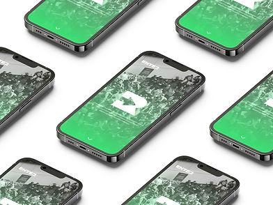
COMMISION WORK
ENTER ETTEVÕTLUSKLUBI REBRAND
I was tasked with rebranding ENTER ETTEVÕTLUSKLUBI to address issues with the previous logo, which resembled another business club, lacked distinct colors, and didn’t display well on the website. The new design improves visibility both online and in print. Green was chosen for its association with investment and money, aligning with the club’s business focus. The logo also incorporates a door, symbolizing opportunity and growth for entrepreneurs. The final result is a unique, recognizable identity that better reflects the club's mission.
ENTER`S GALLERY


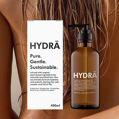
OCTOBER 2024
PERSONAL PROJECT
HYDRÄ
This project for 'Hyrdä,' an eco-conscious shampoo brand, originated from an Instagram design brief. I employed a minimalistic approach, using an earthy, natural color palette to reflect the brand’s sustainable mission. To convey the sulfate-free, gentle care message, the design remained simple and clean, with imagery added to enhance the aesthetic. Although I plan to refine this work in the future, it was an invaluable learning experience in balancing visual simplicity with brand values.
HYDRÄS`S GALLERY


